Modulab Design System
— 2020/21
A product serving products for faster, smarter and better design.
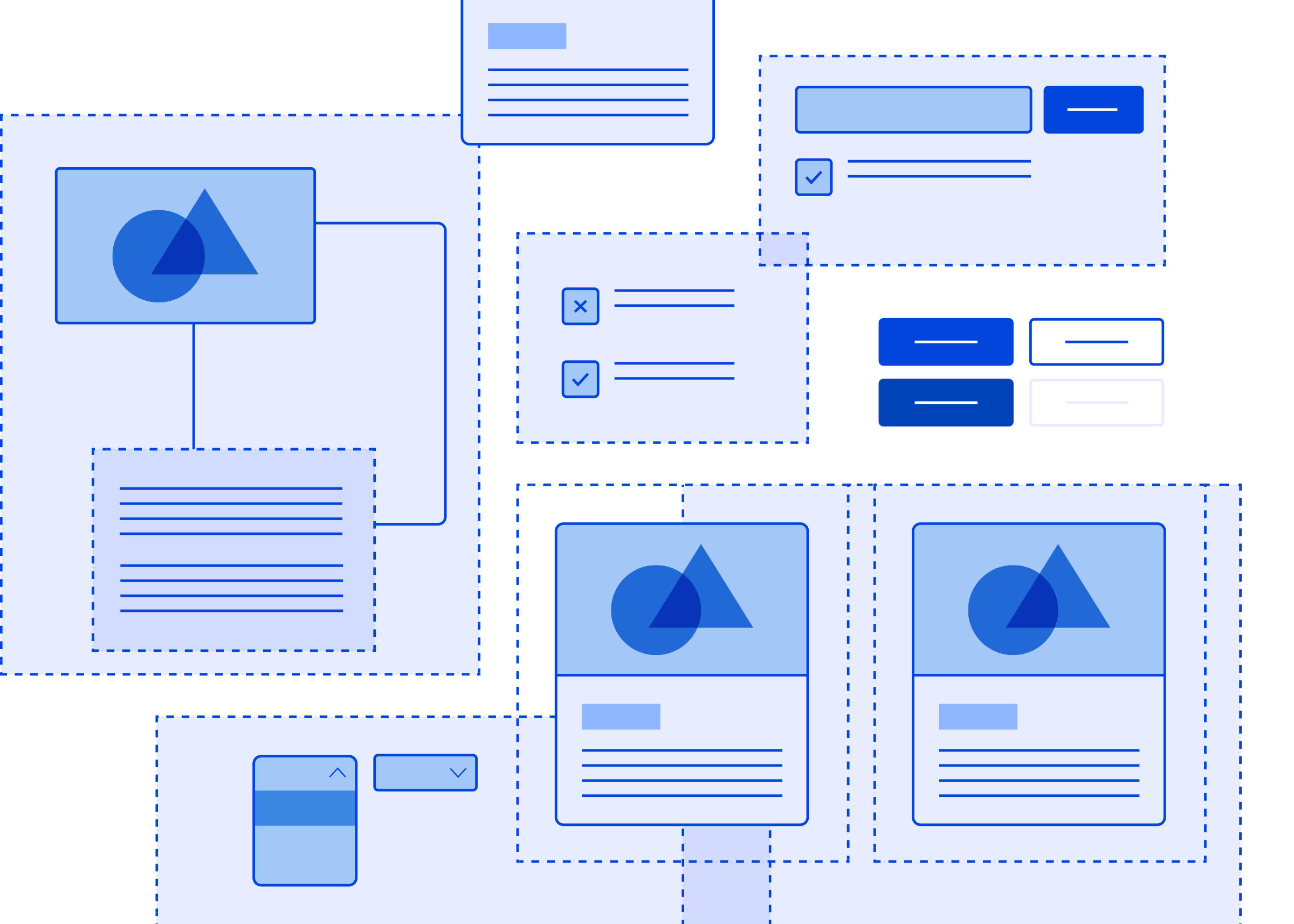
Modulab Design System is the parent theme for multiple websites within the Hyphen Group portfolio. It is a series of styles and components, built systematically, and follows the same universal principles.
DELIVERABLES
UX and visual design for the Modulab component library
Sketch symbol library
Alignment with development for sketch library and react components
Objectives
Speed
With the Modulab Design System we aimed to increase speed to market by creating a shared library of reusable components and guidelines. This saves production hours, helps to speed up the UI design and development process for every project.
Gaining time
We want Modulab to take care of the UI patterns. This empowers designers to work on the things that matter most, the users.
Consistency
Modulab supports platforms in three markets and is growing. To keep the experience consistent for our users it must be based on the best practices with a clear set of standards.
Scalable
Modulab components need to come in many variants that cover different use cases. They are created with design and code that is scalable and reusable.
Low maintenance
With only one single source of truth, we want Modulab to be easily maintainable to keep the design and technical debt low. No more asking who has the latest design.
Future proof
Design trends and features change over time. Modulab needs to be built in a way that enables it to keep up to date with ever changing design trends.
Making impact quickly
To get a buy in from both management and product teams, they needed to see the value of the design system quickly. We want the design system be:
- Easy to use as to reduce the friction of using it
- Well documented so anyone can use it including non designers & engineers
- Have a space where people can see the behaviour of the components in action
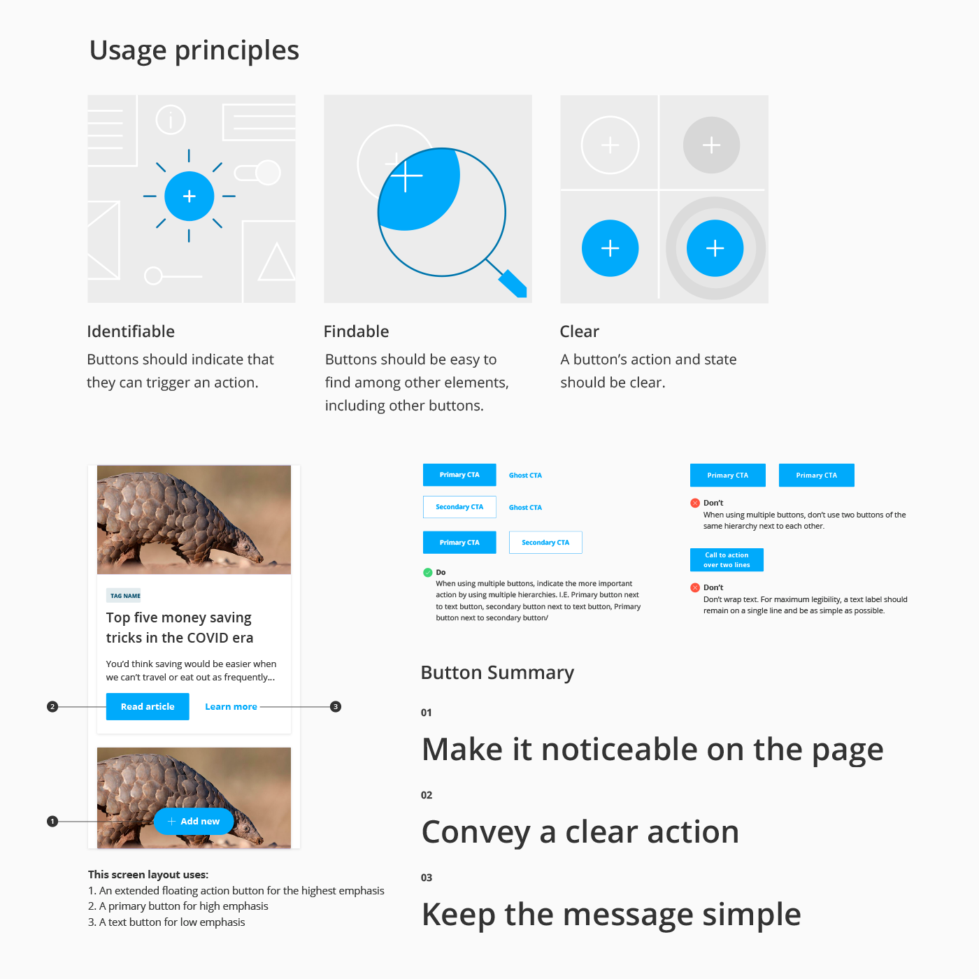
EXAMPLE OF DOCUMENTATION
The Foundations
Google Material Design was used as a starting point and guide for component states and best practices. There was no need to re-invent the wheel for this project so Material Design made sense as the foundation and we diverged for certain components where required.
Brad Frost’s atomic structure was used to create a robust design system, allowing us to roll out higher quality, more consistent designs faster by breaking the UI into components instead of pages. The components needed to follow brand guidelines for a unified site feel but follow updated spacing, styling and vertical rhythm to increase the usability of the sites. Parent and child themes were created so the component styles could be easily adapted for each brand site, which also saves development time!
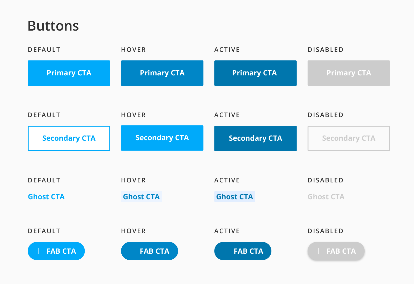
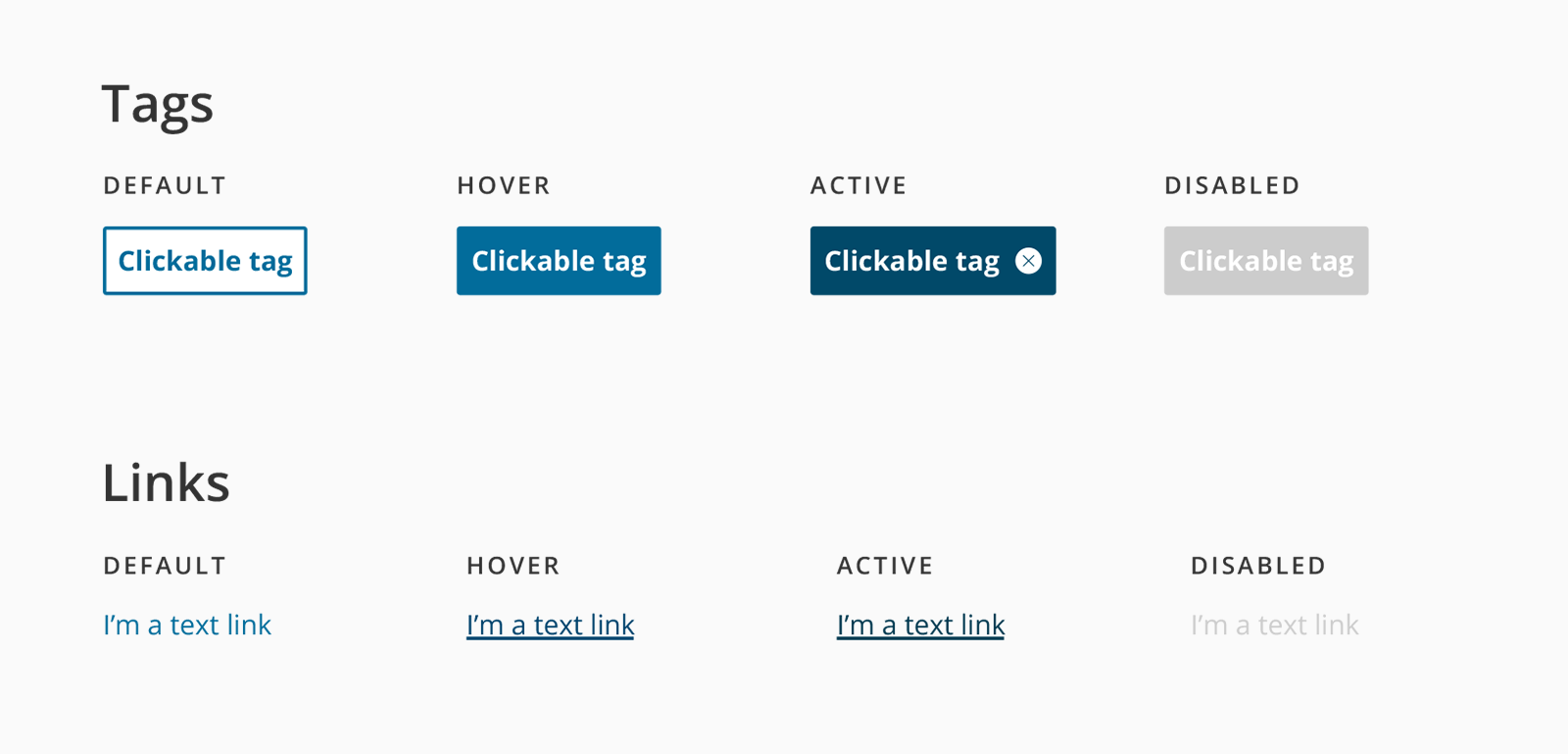
ATOMS
Atoms serve as the foundational building blocks that comprise all our user interfaces. These are things like: buttons, tags and icons:
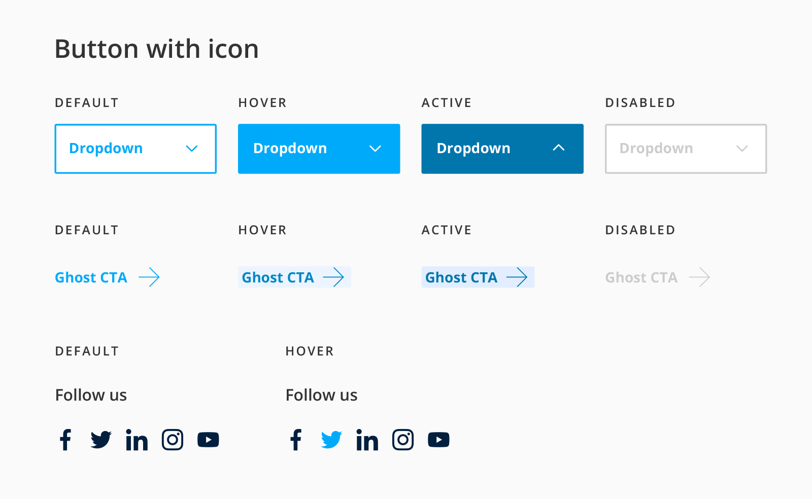
MOLECULES
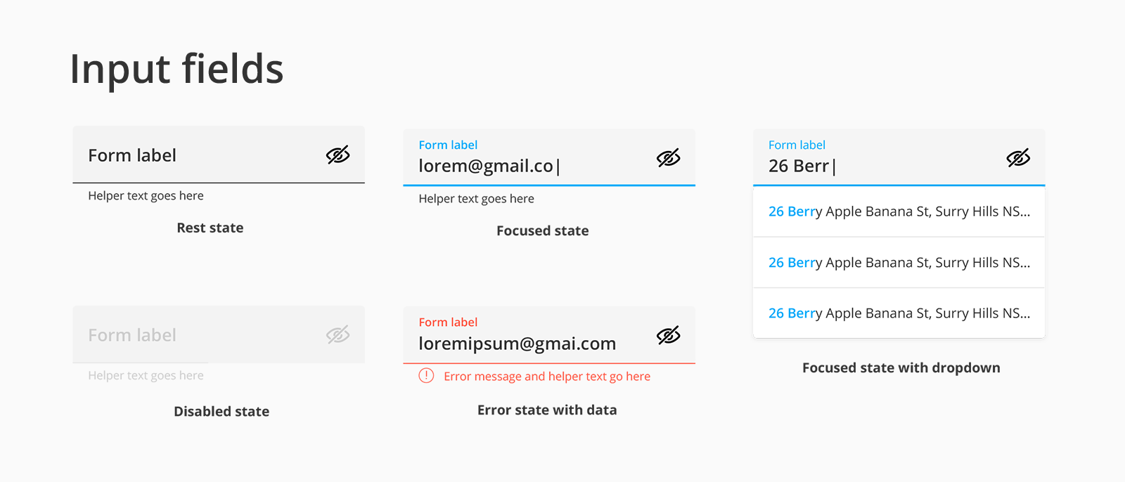
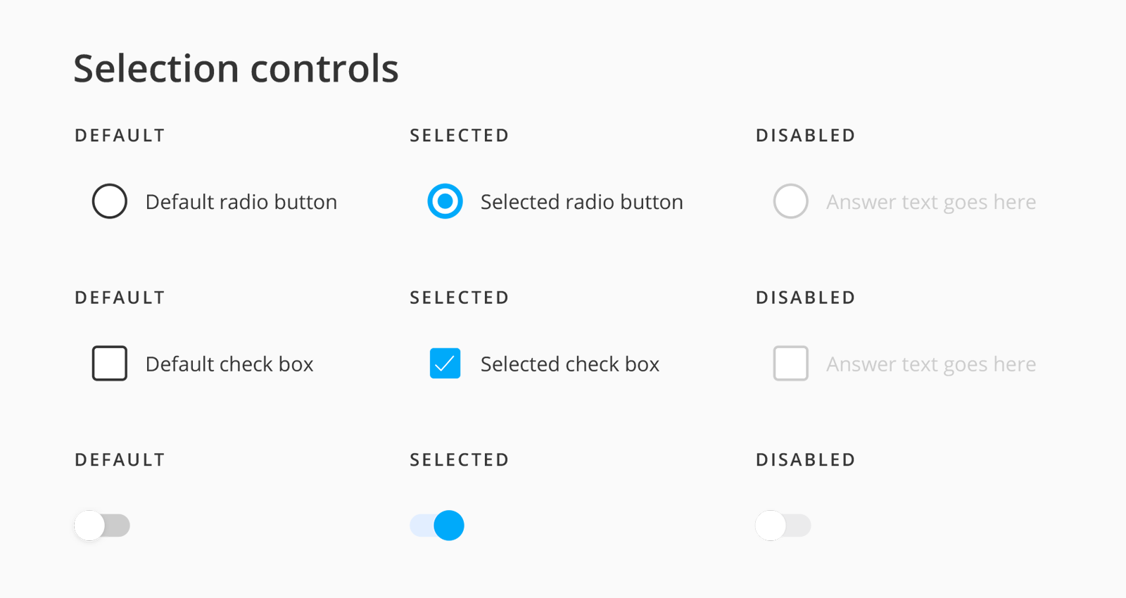
Molecules are relatively simple groups of UI elements functioning together as a unit, such as a selection controls and input fields.
ORGANISMS
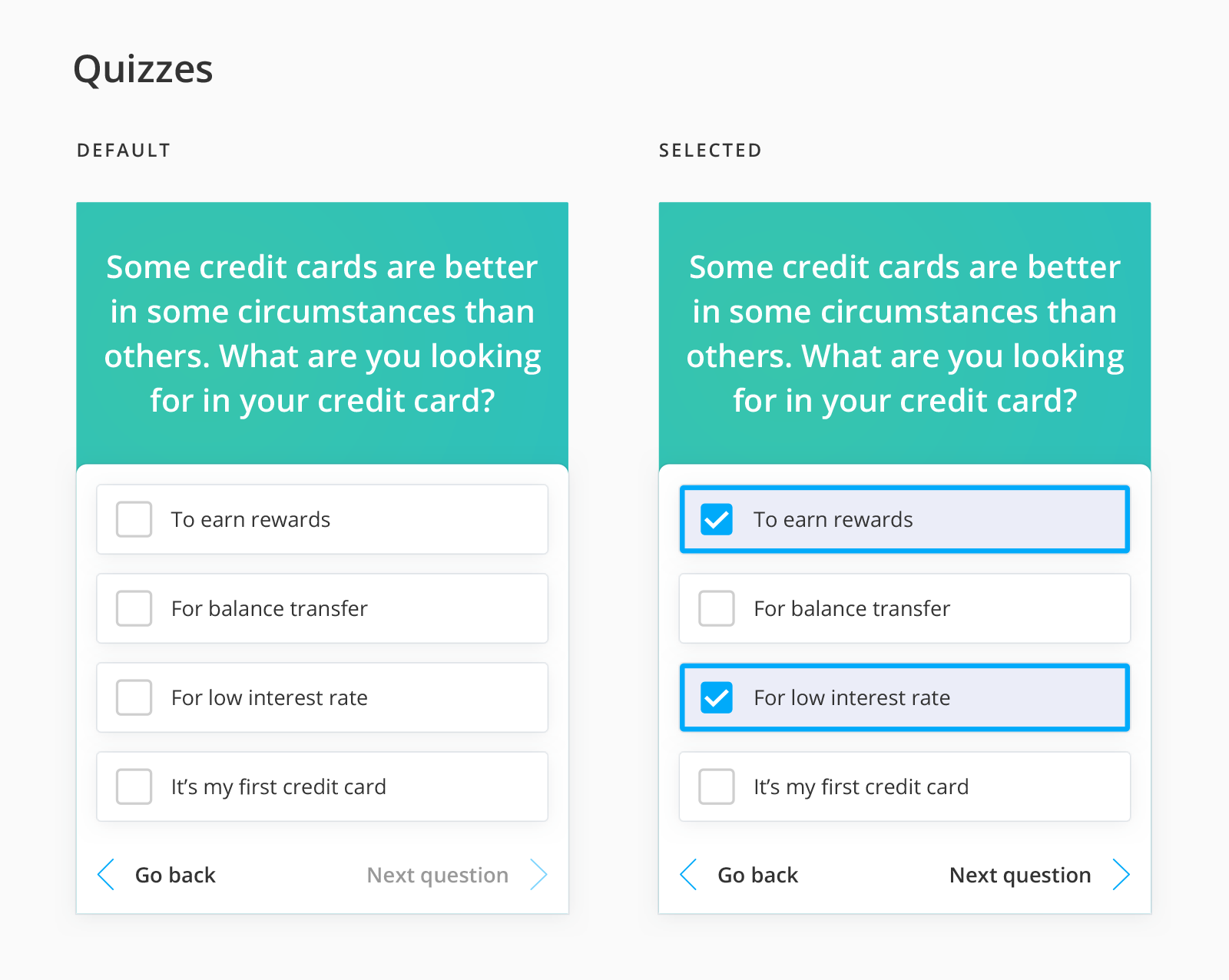
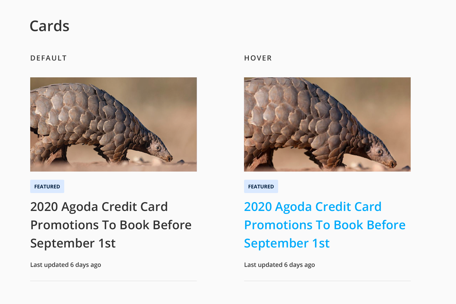
Are groups of molecules joined together to form a relatively complex, distinct section of an interface, such as a content card:
MEASURING SUCCESS
Metrics
The rollout of the Modulab Design System came with a need for measurable success metrics. It’s still too early for results but the metrics in place are:
- Define & measure impact on the users (the user experience): Page load speed, conversion rate, bounce rate, bug & errors
- Define & measure impact on the business: Product speed to market, onboarding time (designer and developers), tech and design debt, QA resources
- Define & measure impact on the team: Measure adoption (design system usage test using plugin), usage surveys, speed and efficiency
All Works
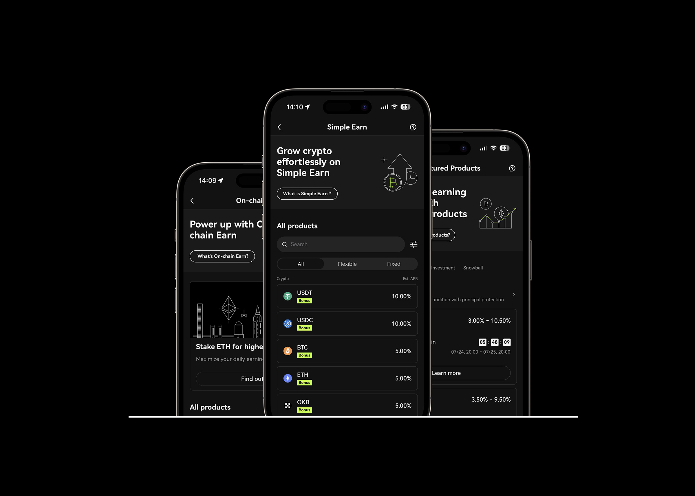
Earn RestructureProduct Design - OKX
Seagull Structured ProductProduct Design - OKX
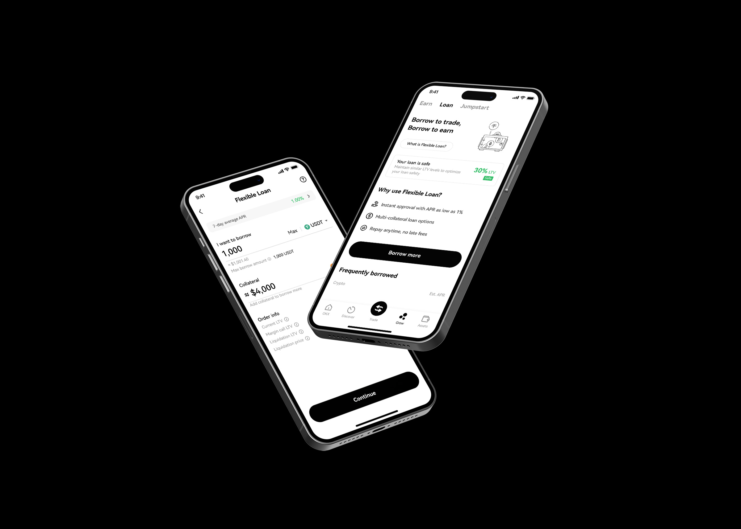
Flexible Loan RevampProduct Design - OKX

BitMEX Spot TradingProduct Design - BitMEX

Fiat on-rampProduct Design - BitMEX

Crypto ConverterProduct Design - BitMEX

BitMEX EarnProduct Design - BitMEX

Login FunctionalityProduct Design - Hyphen Group
Rosewood Hotel GroupUI UX Design - Isobar
Modulab Design SystemDesign Systems
Victoria Dockside PitchUX UI Design - Isobar
HCF Australia Customer Comms MappingCustomer Experience - The Now Protocol
Ecotopia - Siam DiscoveryArt Direction - Isobar
Honor 20 CampaignArt Direction - Isobar
The RoadmapSaaS - The Now Protocol